

Over 60% of research professionals misinterpret their own data, not because the analysis is wrong, but because the visualization fails them. When you present complex findings in the wrong chart type or with poor design choices, you obscure patterns that should be obvious. Effective data visualization transforms raw numbers into immediate understanding, turning hours of analysis into seconds of clarity. This guide will show you proven techniques to choose the right visualization type, apply design principles that enhance comprehension, and craft data stories that drive decisions. You will learn how to communicate research insights with precision and impact.
Table of Contents
- Why Data Visualization Matters In Research
- Choosing The Right Visualization Type For Your Research
- Design Elements: Color, Clarity, And Accessibility In Visualizations
- Data Storytelling: Turning Visuals Into Compelling Narratives
- Enhance Your Data Visualization With Veridata Insights
- Frequently Asked Questions About Data Visualization In Research
Key takeaways
| Point | Details |
|---|---|
| Visual processing speed | Data visualization reduces mental effort and speeds interpretation by leveraging natural visual perception. |
| Chart type precision | Choosing the right chart type prevents data misinterpretation and ensures accurate message delivery. |
| Design impact | Color and design significantly boost engagement and clarity when applied with accessibility in mind. |
| Narrative power | Data storytelling increases impact and decision influence by connecting insights to context and action. |
Why data visualization matters in research
Data visualization techniques organize meaning to make it visible, enhancing the interpretation of large datasets. When you transform complex numbers into patterns and shapes, you tap into the brain’s natural ability to process visual information faster than text or tables. This shift reduces cognitive load dramatically, letting you extract insights in minutes rather than hours.
The human brain interprets visual cues like position, shape, size, and movement almost instantly. A well-designed chart reveals trends, outliers, and correlations that remain hidden in spreadsheets. Without effective visualization, researchers face extended analysis times, increased error rates, and poor communication of findings to stakeholders who need to act on the data.
Consider the common challenges you encounter with raw data tables. Scanning hundreds of rows to identify a trend wastes time and invites mistakes. Explaining complex patterns to clients or executives without visuals leads to confusion and misalignment. Effective visualization solves these problems by making data relationships obvious at a glance.
“Visual representations transform abstract numbers into concrete understanding, enabling faster and more accurate decision-making across research teams.”
The benefits extend across every stage of your research process:
- Faster decision-making through immediate pattern recognition
- Clearer insights by highlighting key relationships and outliers
- Enhanced collaboration when teams share visual dashboards
- Improved stakeholder communication with intuitive presentations
- Reduced analysis errors by making anomalies visually obvious
Visualization plays a critical role at every data analysis stage. During exploration, charts help you discover unexpected patterns. During validation, visuals reveal data quality issues. During communication, they convey findings persuasively. During monitoring, dashboards track key metrics in real time. Integrating data processing and dashboards into your workflow ensures you maximize the value of every dataset.
Choosing the right visualization type for your research
Different chart types serve distinct purposes, and matching your data to the right format determines whether your audience understands or misinterprets your findings. Bar charts excel at comparing categories, line charts reveal trends over time, scatter plots show correlations, and pie charts display proportions. Using an incorrect chart type can lead to misinterpretation in 65% of analyst cases, undermining even the most rigorous research.

Start by identifying your message intent. Are you comparing values across groups, showing change over time, revealing distribution patterns, or illustrating relationships between variables? Your answer dictates the visualization type. For example, if you want to show how customer satisfaction scores differ across regions, a bar chart provides immediate clarity. If you want to demonstrate how satisfaction has changed month by month, a line chart makes the trend obvious.
Consider your data characteristics as well. Categorical data suits bar charts and column charts. Time series data requires line charts or area charts. Continuous numerical data works well in histograms or box plots. Relational data benefits from scatter plots or bubble charts. Hierarchical data fits tree maps or sunburst diagrams.
| Chart Type | Best Use | Common Pitfall |
|---|---|---|
| Bar chart | Comparing discrete categories | Using too many categories, making bars hard to distinguish |
| Line chart | Showing trends over time | Plotting unrelated time series together without clear differentiation |
| Scatter plot | Revealing correlations between two variables | Overplotting data points, obscuring the relationship |
| Pie chart | Displaying proportions of a whole | Using more than five slices, making comparison difficult |
| Heat map | Showing patterns across two dimensions | Poor color scale choices that hide variation |
Pro Tip: Avoid chart junk like excessive gridlines, 3D effects, and decorative elements that distract from your data. Simplicity enhances clarity and keeps attention on the insights.
Once you understand your message and data type, test your visualization with a small audience. Ask if the key insight is immediately obvious. If viewers need explanation, your chart choice may be wrong. Refining your approach based on feedback ensures your visuals communicate effectively. Exploring the power of data processing alongside visualization selection strengthens your overall research presentation.
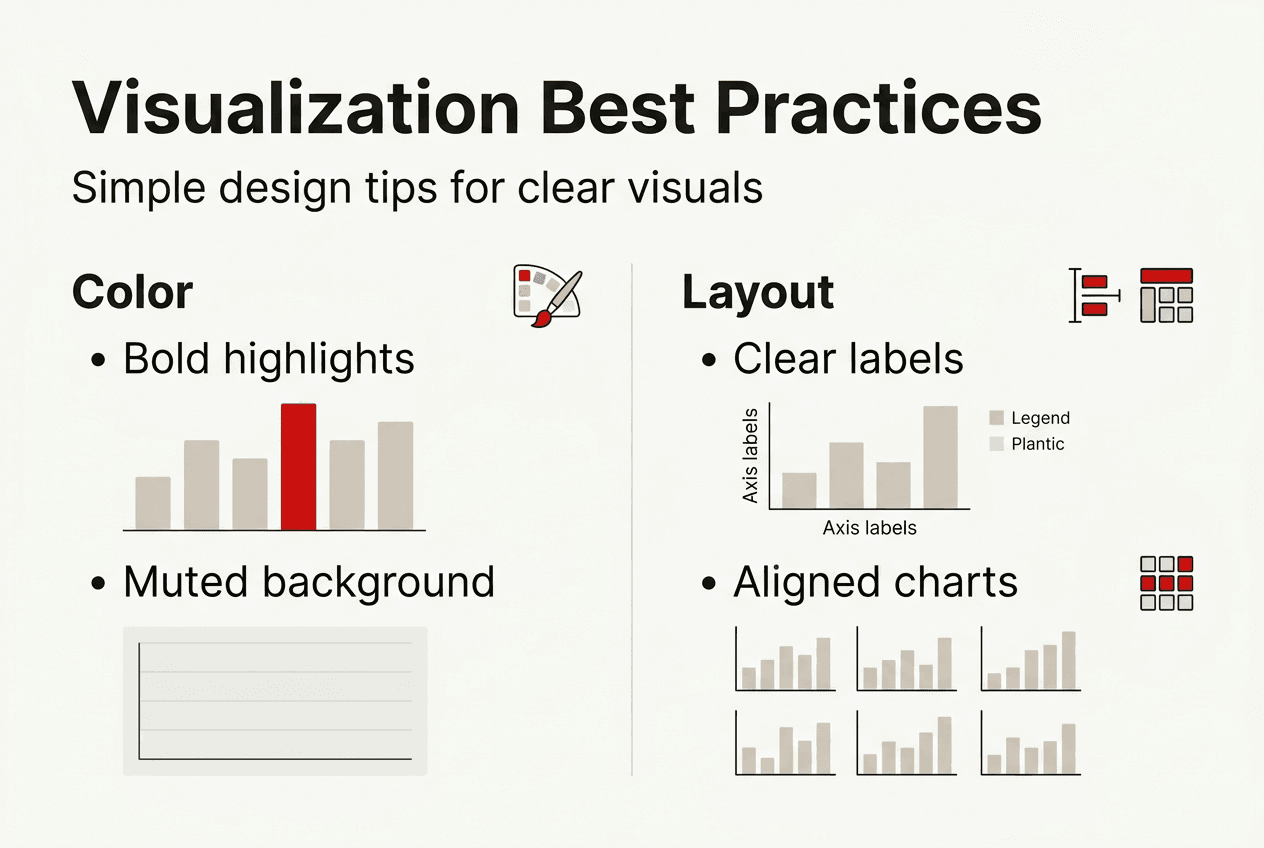
Design elements: color, clarity, and accessibility in visualizations
Color choice influences attention, comprehension, and emotional response in ways that can make or break your visualization. Using color effectively can improve viewer engagement by up to 80%, but poor color decisions create confusion and exclude audiences. Your design should emphasize key data points, avoid distractions, and ensure every viewer can interpret your visuals regardless of visual ability.
Start with a clear color hierarchy. Use bold, saturated colors for the most important data and muted tones for secondary information. Limit your palette to three or four colors to prevent visual overload. Ensure sufficient contrast between elements so distinctions remain obvious even on low-quality displays or in printed materials.
Accessibility considerations are non-negotiable in professional research. Approximately 8% of men and 0.5% of women have some form of color vision deficiency, meaning red-green distinctions may be invisible to them. Avoid relying solely on color to convey meaning. Use patterns, labels, or shapes alongside color to ensure all viewers can interpret your data. Add alternative text descriptions for screen readers when publishing visualizations online.
Design best practices that enhance clarity include:
- High contrast between background and foreground elements for readability
- Readable font sizes, typically 12 points or larger for body text
- Generous whitespace to separate visual elements and reduce clutter
- Consistent styling across all charts in a report or presentation
- Clear axis labels and legends positioned for easy reference
Pro Tip: Test your visualizations with colorblind simulation tools like Color Oracle or Coblis before finalizing. This ensures your palette works for all viewers and prevents last-minute redesigns.
Beyond color, consider layout and composition. Align chart elements to create visual flow. Place titles and labels where eyes naturally land first. Use size and position to create emphasis without adding unnecessary decoration. When you apply these principles consistently, your visualizations become intuitive and professional. Translating complex data into client-friendly presentations requires mastering these design fundamentals.
Data storytelling: turning visuals into compelling narratives
Data storytelling combines context, insight, narrative flow, and a clear call to action to transform static charts into persuasive communications. Presentations using data storytelling have a 30% higher rate of influencing decision-making compared to those that simply display numbers. When you integrate narrative techniques with your visuals, you make findings memorable and actionable for stakeholders who need to act on your research.
Effective data storytelling follows a structured process that guides your audience from context to action:
- Introduce context by explaining why the data matters and what question you are answering
- Highlight key insights by directing attention to the most important patterns or findings
- Sequence the narrative logically, building from problem to evidence to solution
- Recommend specific actions based on the data, making next steps clear and concrete
Start by framing the business problem or research question. Your audience needs to understand why they should care before you show them charts. Provide just enough background to orient them, then move quickly to the data. As you present visuals, point out the specific elements that support your conclusions. Use annotations, callout boxes, or progressive reveals to focus attention on critical data points.
Narrative sequencing matters because it shapes how your audience interprets each piece of information. Present data in an order that builds understanding logically. If you are showing a problem and solution, lead with the problem data to establish urgency, then reveal the solution data to demonstrate impact. If you are comparing options, present criteria first, then show how each option performs.
“Stories transform data from abstract numbers into human experiences, making insights resonate emotionally and intellectually with decision makers.”
Avoid common pitfalls that weaken data stories. Overloading visuals with too many data series or annotations creates confusion rather than clarity. Disconnecting your narrative from the data by making claims unsupported by the visuals erodes credibility. Failing to provide a clear call to action leaves your audience uncertain about next steps. Keep your story focused, evidence-based, and action-oriented.
When you master data storytelling, you increase comprehension and retention of your research findings. Stakeholders remember stories far better than isolated statistics. They also feel more confident acting on recommendations supported by a coherent narrative. Integrating driving data visualization with narratives into your research workflow ensures your insights lead to real business impact.
Enhance your data visualization with Veridata Insights
Veridata Insights offers expert data visualization and dashboard services tailored specifically to research needs, helping you turn raw data into clear strategic insights quickly. Their team understands the challenges market researchers face when communicating complex findings to diverse stakeholders. Whether you need custom dashboards for ongoing monitoring or polished presentation visuals for client reports, their solutions ensure your data tells its story effectively.
Leveraging professional support allows you to apply the visualization techniques covered in this guide without investing time in mastering specialized tools. Veridata Insights handles everything from data processing to final visual design, delivering client-ready outputs that enhance your research credibility. Their flexible service model means you can engage for a single project or build an ongoing partnership, with no minimums and year-round availability. Explore their data processing and dashboards services to see how they can elevate your research presentations, or contact Veridata Insights to discuss your specific visualization needs.
Frequently asked questions about data visualization in research
What is the most important factor in effective data visualization?
Clarity is the most important factor. Your visualization should communicate its key message within seconds without requiring explanation. If viewers struggle to understand the insight, the chart has failed regardless of how visually appealing it looks.
How do I choose the best chart for my data?
Match your chart type to your message intent and data characteristics. Use bar charts for category comparisons, line charts for time trends, scatter plots for correlations, and pie charts for proportions. Test your choice with a sample audience to confirm the insight is immediately obvious.
Can data visualization improve research communication to non-experts?
Absolutely. Well-designed visuals translate technical findings into intuitive formats that non-experts grasp quickly. Use simple chart types, clear labels, and minimal jargon to make complex research accessible to broader audiences including executives and clients.
What design mistakes should I avoid in data visualization?
Avoid chart junk like 3D effects, excessive gridlines, and decorative elements that distract from data. Do not use too many colors or rely solely on color to convey meaning. Skip pie charts with more than five slices and always ensure sufficient contrast for readability.
How can I make visualizations accessible to all users?
Use colorblind-friendly palettes with high contrast, add patterns or shapes alongside color coding, include descriptive labels and alternative text, and test your visuals with accessibility tools. Ensure font sizes are readable and avoid relying on color alone to distinguish data categories.
Recommended
- Why Quality Customer Service is Essential to Drive Data Visualization – Veridata Insights
- The Power of Data Processing and Visualization – Veridata Insights
- Navigating Data Gaps: Creative Solutions for Research Challenges – Veridata Insights
- Data Processing, Dashboards & Visualization – Veridata Insights
- Maximize business impact with data analytics in 2026
- 3D Booth Visualization: Elevating Trade Show Impact


