

The most effective storytelling with survey data follows one recipe: identify the single strongest signal in your results, pair it with the simplest accurate visual, and close with a specific business recommendation your stakeholders can act on today. That’s it. Everything else, the methodology footnotes, the subgroup tables, the cross-tabs, are supporting evidence for that one move.
Before you write a single slide headline, run through this checklist:
- Who was surveyed: sample size, audience definition, fielding dates, and any weighting applied
- Key metric and direction: the number that matters and whether it went up, down, or split by group
- Subgroup edge: the one comparison that changes the business decision (e.g., loyal customers vs. new buyers)
- Confidence and caveat: margin of error or a plain-language note on what the data cannot prove
- Recommended action: one sentence that tells decision-makers what to do next
Once you have those five elements, you’re ready to prepare a one-slide recommendation or schedule a 10-minute decision brief with your stakeholders.
Key Takeaways
Effective storytelling with survey data requires a clear signal, an honest analytical check, a position-based visual, and a single recommended business action stated explicitly for stakeholders.
| Point | Details |
|---|---|
| Lead with the recommendation | State the business action in your headline, not your conclusion slide. |
| Validate before you narrate | Check subgroup sample sizes, margin of error, and weighting before building the story. |
| Use position-based visuals | Bar charts and dot plots outperform pie charts for accurate numeric decoding. |
| Pair quotes with statistics | An open-text quote gains credibility when anchored to a frequency or percentage from the same data. |
| Veridata Insights | Provides full-service survey analysis, coding, and slide-ready reporting to deliver decision-ready stories. |
Table of Contents
- What does storytelling with survey data actually mean for business?
- How do you turn survey results into a story in four steps?
- How to analyze and prioritize survey findings before you build the story
- How do you turn open-ended responses into persuasive proof?
- Which charts work best for common survey data types?
- How should you structure the narrative for survey results?
- Three short examples of survey stories that drove decisions
- How do you package and share a survey story so it actually gets used?
- Veridata Insights turns your survey data into decision-ready stories
- Sources
What does storytelling with survey data actually mean for business?
Data storytelling is the practice of combining a clear narrative, purposeful visuals, and a direct business recommendation to turn survey results into decisions. It’s not a presentation style. It’s a discipline. Raw survey outputs, frequency tables, mean scores, open-text dumps, inform no one by themselves. A well-structured story built from those outputs can shift a budget, change a product roadmap, or stop a bad hire.
For decision-makers, the business case is concrete. A narrative using survey results speeds up decisions by reducing the cognitive work required to interpret data. It surfaces trade-offs clearly, so stakeholders can weigh options rather than debate methodology. It helps teams prioritize because the story forces the analyst to rank insights by impact before the meeting even starts. And it aligns stakeholders around a shared reading of the evidence, which cuts the “but what does this really mean?” back-and-forth that stalls action.
Business-focused data storytelling must explicitly link data to a specific, recommended action for stakeholders rather than only informing or entertaining. That distinction separates a survey story from a survey report.
Pro Tip: Tailor the opening frame to your audience. Executives want the recommendation first and the evidence second. Managers want the subgroup breakdown that affects their team. Technical teams want the methodology and confidence intervals. Write one story, then adjust the first slide and the level of analytical detail for each room.
How do you turn survey results into a story in four steps?
A repeatable workflow keeps your team from reinventing the process every time a survey closes. Here’s the one we recommend.
- Find the signal. Pull your top-box scores, means, and net scores. Sort by variance from benchmark or prior wave. Flag the three metrics that moved most or differ most sharply across subgroups. Your story lives in the biggest gap, not the average.
- Analyze and validate. Check sample sizes for every subgroup you plan to feature. Confirm the margin of error is acceptable for the claim you want to make. Review weighting variables and confirm conditional question logic didn’t route respondents away from key items. Run a quick plausibility check: does the finding make sense given what you know about this audience?
- Craft the narrative. Write the headline first, not last. “Frontline employees are 22 points less satisfied than managers, and the gap is widest in the Southeast region.” That sentence is your story. Everything else, the chart, the supporting stats, the open-text quotes, exists to prove and contextualize it.
- Recommend and share. State the business action explicitly. “We recommend prioritizing manager training in the Southeast before the Q3 performance cycle.” Package the story in the format your stakeholders actually use: a slide deck, a one-page brief, or an embedded dashboard. Practical frameworks from HBS Online reinforce that the output of this step should be a clear managerial recommendation, not a summary of findings.
The output of this workflow is a single slide or one-paragraph brief that your stakeholder can forward to their leadership without editing.
How to analyze and prioritize survey findings before you build the story
Good storytelling starts with honest analysis. Before you pick your headline metric, run these practical checks.
Sample size and subgroup counts are the first gate. A subgroup with fewer than 30 respondents is almost always too small to feature in a business recommendation without a caveat. Subgroups between 30 and 80 respondents can appear in the story, but flag them explicitly. Anything above 100 gives you reasonable confidence for directional claims.
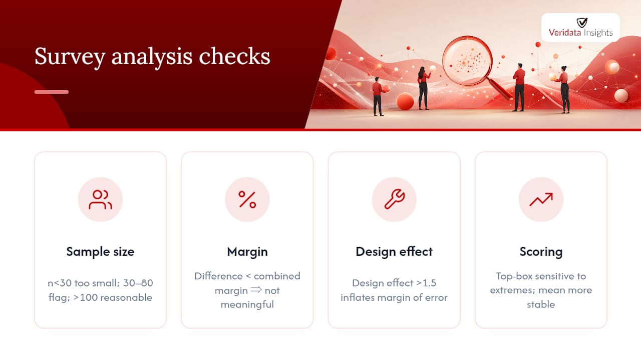
Margin of error tells you how much the reported percentage could vary if you ran the same survey again. When two subgroups differ by less than the combined margin of error, the difference is not reliably meaningful, and you should not build a story around it.
Weighting and design effect matter when your sample was stratified or quota-controlled. A design effect above 1.5 inflates your effective margin of error, which means your subgroup comparisons need wider confidence bands than the raw counts suggest. Check this before you declare a finding significant.
Top-box vs. mean scores tell different stories. Top-box (the percentage choosing the highest one or two response options) is more sensitive to shifts at the extremes and is often more persuasive for stakeholders. Mean scores are more stable but can mask polarization. Use both, and note when they diverge.
Prioritizing by business impact means ranking your validated signals by three criteria: effect size (how large is the difference?), plausibility (does it fit what we know?), and actionability (can the business actually do something about it?). A large effect that no one can act on is a footnote, not a headline.
Pro Tip: Flag any subgroup comparison where the base size is below 50 with a simple note: “directional only, interpret with caution.” Then offer the full-sample finding as the reliable anchor. This protects your credibility and keeps the story honest.
Visualization technique guidance reinforces that choosing the right analytical lens before you choose a chart type is what separates insightful survey data analysis from decorated spreadsheets.
How do you turn open-ended responses into persuasive proof?
Open-ended questions are where the emotion lives. Closed questions tell you what percentage of customers are dissatisfied. Open-ended responses tell you they feel “ignored every time they call support.” That specificity is persuasive in a way that a bar chart cannot be.
The challenge is turning hundreds or thousands of verbatim responses into something a stakeholder can absorb in 90 seconds. Here’s how to do it without overstating what the data shows.
- Manual coding works well for samples under 300 responses. Build a codebook of 8 to 12 themes, code a random sample of 50 responses to test reliability, then code the full set. Report theme frequency as a percentage of total respondents who mentioned it.
- Supervised topic modeling (using tools like LIWC, MonkeyLearn, or a custom classifier) scales to thousands of responses. Always validate the model’s output against a manually coded holdout sample before reporting.
- Sentiment scoring adds a positive/neutral/negative layer to each theme. Pair sentiment with frequency: a theme mentioned by 40% of respondents with 80% negative sentiment is a crisis signal, not a footnote.
- Keyword tagging is the fastest method but the least precise. Use it for exploratory passes, not final reporting.
For quotes, follow these rules:
- Always pair a quote with the statistic it illustrates. “One in three customers mentioned wait times unprompted. As one respondent put it: ‘I gave up after 45 minutes on hold.’” The stat gives the quote weight; the quote gives the stat a face.
- Never use a quote that represents fewer than 5% of responses as if it speaks for the group.
- Anonymize respondents appropriately, especially in employee surveys. Remove identifying details without altering the meaning.
- Do not cherry-pick the most dramatic quote. Pick the most representative one.
Which charts work best for common survey data types?
Chart selection is not a design decision. It’s an analytical one. The chart you choose determines how accurately your audience decodes the numbers, and that accuracy directly affects the quality of the decision they make.
Graphical-perception research shows that position-based encodings, where values are read from position on a common scale, produce more accurate numeric decoding than encodings based on area, volume, or color saturation. That’s why bar charts beat pie charts for survey data almost every time. A reader can judge the length of a bar far more precisely than the angle of a slice.
| Survey variable type | Recommended chart | Why it works |
|---|---|---|
| Categorical comparison (e.g., satisfaction by segment) | Horizontal bar chart | Position on a shared axis; easy to rank and compare |
| Trend over time (e.g., NPS across waves) | Line chart | Shows direction and rate of change clearly |
| Relationship between two variables | Scatterplot | Reveals correlation patterns across respondents |
| Distribution of a scale item | Dot plot or diverging bar | Shows spread and polarity without hiding skew |
| Proportion of a whole | Stacked bar (not pie) | Maintains position encoding; avoids angle decoding |
| Subgroup comparison on a single metric | Grouped bar or small multiples | Keeps comparisons on a common scale |
For non-technical stakeholders, annotate directly on the chart. Draw an arrow to the bar that matters. Add a text label that says “22-point gap” rather than making the audience calculate it. Simplify axes to remove gridlines that don’t aid reading. Use color sparingly: one highlight color for the finding that drives the recommendation, gray for everything else.
Scrollytelling, revealing one insight at a time with animated transitions, is particularly effective for complex survey findings with multiple subgroups. Tools like Flourish let you build scroll-driven presentations that walk stakeholders through the story one comparison at a time, which prevents cognitive overload and keeps attention on the signal rather than the noise.
Pro Tip: Pick the simplest visual your audience will correctly interpret without extra explanation. A sophisticated chart that requires a legend tutorial is a barrier, not a feature. When in doubt, default to a horizontal bar chart with direct labels.
For more on matching visuals to audience context, the data visualization in polling guide from Veridata Insights covers chart selection rules specifically for survey and polling research.
How should you structure the narrative for survey results?
An effective survey data narrative follows a consistent structure: who was surveyed, what they did, how they feel, how subgroups differ, patterns in outcomes, and what the results mean for the business. That structure is not arbitrary. It mirrors how decision-makers process new information, moving from context to evidence to implication to action.
Here’s the template, slide by slide or paragraph by paragraph:
- Who was surveyed: Sample size, audience definition, fielding dates, weighting. One sentence. This is your trust signal.
- What they did or experienced: The behavior or situation the survey captured. Sets context.
- How they feel: Your headline metric. Top-box score, NPS, mean rating. State the number and its direction.
- How subgroups differ: The one comparison that changes the story. Keep it to two groups maximum per slide.
- Patterns in outcomes: What the data shows consistently across questions or waves. This is where you earn credibility.
- Business implication: What this means for the organization. One sentence, no jargon.
- Recommended action and next steps: What you’re asking stakeholders to do, and by when.
Here’s a short example built from a fictional employee engagement survey:
“In March 2026, we surveyed 847 full-time employees across five U.S. regions (weighted to reflect headcount). Across all regions, recognition and career development are the two lowest-rated drivers, consistent with open-text themes mentioning ‘no feedback’ and ‘no path forward.’ This pattern suggests the engagement risk is structural, not situational. We recommend launching a manager coaching program in the Southeast before the Q3 performance cycle, with a follow-up pulse survey in 90 days to measure impact.”
That’s seven sentences. It covers all seven template elements. It ends with a specific ask.
For the methodology disclosure, include this snippet in a footnote or appendix slide: “Survey conducted [dates], n=[total], [audience definition], [mode], [weighting variables and rationale].” Transparency here builds trust without cluttering the story.
Business data storytelling that links findings to a specific recommended action is what separates a research report from a decision tool. The template above is designed to make that link explicit every time.
Three short examples of survey stories that drove decisions
These mini cases show how raw survey outputs map to a single slide and a one-line recommendation. Each follows the workflow and structure described above.
Customer satisfaction: spotting a loyalty risk
Chart used: Horizontal grouped bar chart comparing “contacted support” vs. “no support contact” across four satisfaction dimensions.
Why that visual: The grouped bar keeps both groups on a common scale, so the gap is immediately visible without calculation. Color highlights the support-contact bar in each pair.

One-line recommendation: “Prioritize a support experience audit before the next product launch to prevent satisfaction erosion among your highest-engagement customers.”
Employee engagement: a subgroup risk hiding in the average
Chart used: Small multiples (one bar per region), sorted by score, with the Southeast bar highlighted.
Why that visual: Small multiples let the audience compare all regions simultaneously without toggling between slides. Sorting by score makes the outlier obvious.

One-line recommendation: “Allocate Q3 manager development budget to the Southeast region before attrition accelerates in the summer hiring cycle.”
Product feature prioritization: where to invest next
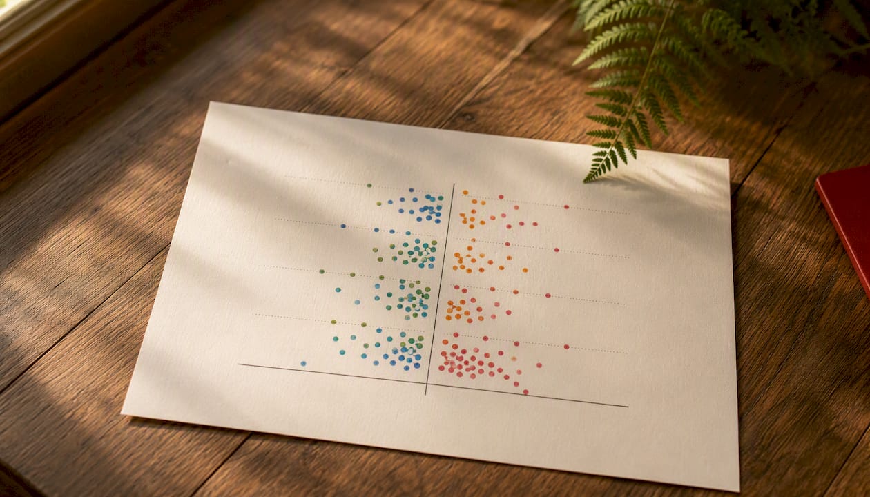
Chart used: Diverging dot plot showing the distribution of first-choice votes by user segment.
Why that visual: A dot plot preserves the distribution rather than collapsing it to a mean, showing that power users are aligned while occasional users are not. That difference is the story.
One-line recommendation: “Build advanced reporting for the Q4 release to retain power users, and defer the remaining features pending a follow-up concept test with occasional users.”
For more applied examples of how survey storytelling influences business outcomes, the Veridata Insights resource library covers real-world cases across B2B and B2C contexts.
How do you package and share a survey story so it actually gets used?
The best analysis in the world stalls if it arrives in the wrong format. Match the package to the stakeholder and the decision timeline.
For slide decks, follow this checklist:
- One takeaway per slide, stated in the headline (not “Satisfaction Results,” but “Support contacts are 22 points less satisfied”).
- The visual fills the slide. One chart, directly labeled, with the key finding annotated.
- One line of evidence below the chart: the sample size, the metric, and the direction.
- The final slide is the ask: what you want the audience to decide or do, and by when.
For dashboards, the rules shift. Interactive reports built in Tableau, Power BI, or Flourish need guided entry points. Don’t drop stakeholders into a blank filter panel. Pre-filter the default view to the most decision-relevant segment. Add a “Decision” panel on the landing page that lists the top three recommendations and their confidence level. Power BI’s data storytelling templates provide a practical starting point for building narrative-driven dashboards that combine interactivity with a clear recommended action.
For one-pagers, lead with the headline finding, follow with three supporting bullets (metric, subgroup, open-text theme), and close with the recommended action and a contact for follow-up. Keep it to one page. Seriously.
Distribution tactics that work:
- Send the one-pager 24 hours before the meeting so stakeholders arrive with context.
- Schedule a 10 to 15-minute decision review rather than a 60-minute presentation. Shorter meetings force you to lead with the recommendation, not the methodology.
- For executive audiences, embed the key chart and recommendation directly in the email body. Attachments get deferred; inline visuals get read.
- For technical teams, include a methodology appendix or a link to the full data file. They’ll trust the story more when they can verify the inputs.
Client survey presentation guidance covers additional format-specific tips for professional services contexts where the audience has high expectations for both rigor and clarity.
Veridata Insights turns your survey data into decision-ready stories
You’ve done the fieldwork. The data is clean. Now comes the part that actually changes decisions: turning those results into a story your stakeholders will act on. That’s exactly where Veridata Insights steps in.
We offer the full range of services that make survey storytelling work: questionnaire review to catch ambiguity before it corrupts your findings, weighting and analysis to ensure your subgroup comparisons hold up, verbatim coding to surface the themes buried in open-text responses, and slide-ready visuals that translate your data into a single, clear recommendation. No project minimums. Available seven days a week.
Whether you need a one-time analysis package or a partner for ongoing tracking studies, Veridata Insights delivers decision-ready survey research built around your business question, not a generic template. Reach out to discuss your next project.
Sources
These resources cover the specific skills that make survey storytelling work, from visual perception evidence to scrollytelling technique to platform documentation.
- Telling a story with survey data – Josh Bernoff
- Graphical perception research (position vs. area/volume/color)
- What great scrollytelling looks like — and how to build it yourself | Flourish
- Five excellent data storytelling examples (and what makes them work)
- Data visualization techniques — Fivetran
- Data Storytelling: How to Effectively Tell a Story with Data — HBS Online