
TL;DR:
- Manufacturing data is abundant but often remains unused or misunderstood without effective visualization tools. Well-designed dashboards improve decision speed, pattern recognition, and cross-functional alignment, leading to operational savings. Ensuring accurate KPI definitions, user involvement, and understanding measurement methods are crucial for impactful manufacturing analytics.
Manufacturing plants generate enormous volumes of data every single hour. Sensor readings, machine logs, quality checks, production counts, downtime events. Most of it sits in databases, never fully seen, never truly acted on. The real challenge isn’t collecting data. It’s turning that data into something your team can actually use. Visualization tools close that gap by converting streams of raw numbers into dashboards that reveal patterns, flag issues, and enable faster, smarter decisions.
Table of Contents
- Why data visualization matters in manufacturing
- From raw data to actionable dashboards: How it works
- Key use cases and benefits for executives and analysts
- Pitfalls to avoid: Behavioral factors and measurement traps
- A fresh perspective: Why context and definitions matter more than technology
- How Veridata Insights can help you maximize value from manufacturing data
- Frequently asked questions
Key Takeaways
| Point | Details |
|---|---|
| Visualization fights data overload | Turning data into visual insights helps focus on what truly matters for action. |
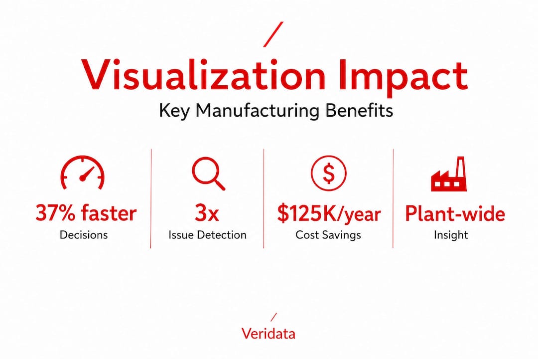
| Dashboards boost decision speed | Live manufacturing dashboards can reduce decision delays by up to 37 percent. |
| OEE accuracy impacts outcomes | Direct sensor-based measurements are more reliable than self-reported OEE figures. |
| Avoid behavioral pitfalls | Success depends on organizational alignment and evaluating effectiveness, not just the tech. |
| Start with clear definitions | Defining and validating KPIs is the foundation for valuable manufacturing analytics. |
Why data visualization matters in manufacturing
Raw data is not intelligence. A spreadsheet with 10,000 rows of machine runtime numbers tells you almost nothing at a glance. A well-built dashboard showing equipment uptime by shift, by line, and by product type tells you everything you need at a glance. That difference is what makes visualization so valuable on the plant floor.
Manufacturing leaders need a centralized operational view. When data lives across disconnected systems, decisions get delayed, patterns go unnoticed, and small problems compound into costly ones. Visualization solves this by pulling data together into a coherent picture that everyone from the floor supervisor to the VP of Operations can interpret quickly.
The core benefits show up in three distinct ways:
- KPI clarity: Teams stop debating what the numbers mean and start acting on what the numbers show.
- Pattern recognition: Recurring issues like micro-stops, cycle-time drift, or quality defect clusters become visible before they snowball.
- Cross-functional alignment: When executives and analysts look at the same dashboard, decision conversations get shorter and more productive.
Industry 4.0 visualization approaches can be operationalized as an OEE-focused dashboard framework that transforms raw machine and productivity data into actionable, real-time insights for identifying operational losses and prompting corrective action.
The impact on operations is concrete and fast. Data processing and visualization done well shortens the feedback loop between what happens on the floor and what decision-makers know about it. Pair that with intentional dashboard strategies and you get a manufacturing operation that stops chasing fires and starts preventing them.
From raw data to actionable dashboards: How it works
Understanding why visualization matters is step one. Understanding how to actually build it into your operations is where most teams get stuck. The pathway from raw shop-floor data to a decision-ready dashboard is a process, and it’s worth walking through clearly.
Here’s how that process looks in practice:
- Collect: Sensors on machines capture real-time data: cycle times, temperatures, speeds, error codes, stop events.
- Aggregate: Data flows into a central system, whether that’s an ERP, MES (Manufacturing Execution System), or a dedicated analytics platform.
- Process and clean: Data gets filtered, normalized, and organized. Duplicate entries, noise, and gaps get addressed so the downstream analysis is reliable.
- Define metrics: Teams agree on how KPIs like OEE (Overall Equipment Effectiveness, a metric tracking the percentage of manufacturing time that is truly productive) will be calculated. This step is often skipped, and it causes major problems later.
- Visualize: Charts, gauges, heat maps, and trend lines are built to surface what matters most to each user role.
- Act: Alerts and thresholds trigger notifications, and teams use the dashboard to guide real decisions in near real time.
The decision latency reduction that comes from near-real-time dashboards is the measurable payoff. Teams detect issues earlier and act before small problems escalate into unplanned downtime or quality escapes.
One important nuance: not all OEE numbers are created equal. Self-reported OEE can be materially higher than sensor-measured OEE because human reporters routinely miss micro-stops, underestimate speed loss, and inflate cycle times. The gap is not small.
| Measurement method | Typical accuracy | Pros | Cons |
|---|---|---|---|
| Self-reported OEE | Lower, 10–18 pts inflated | Low setup cost, flexible | Misses micro-stops, speed loss; biased |
| Direct-sensor IoT OEE | Higher, near-objective | Captures all loss types, automated | Requires hardware investment, integration |
| Hybrid (manual + sensor) | Moderate | Balances cost and accuracy | Requires reconciliation process |
This table is a useful reality check. Before you trust your OEE dashboard, you need to know how the data feeding it was collected.
Pro Tip: Before launching any dashboard, audit your KPI measurement methods. Ask how every metric is captured, who captures it, and whether those methods align with the benchmark logic you plan to use. Definitions matter as much as the visualization itself.
See how this plays out in practice with a data visualization case study that shows what a well-executed solution actually looks like from start to finish.
Key use cases and benefits for executives and analysts
Now that you understand the mechanics, let’s look at where this pays off in real manufacturing environments. The use cases cluster around three high-impact areas.
OEE tracking and operational loss identification. This is the most widely implemented use case. A real-time OEE dashboard shows availability, performance, and quality losses in one view. Supervisors can see which shift or which machine is dragging down the line. A tire manufacturing case study showed how visualization at the individual machine level successfully identified specific operational losses and directly informed corrective decisions. That is visualization doing exactly what it should.
Downtime analysis. Visualizing downtime by cause, frequency, and duration reveals whether your biggest losses come from mechanical failure, changeover delays, or waiting for materials. Without this breakdown, maintenance and operations teams often fix the wrong things first.
Real-time quality alerts. When defect rates climb above a threshold, a well-designed dashboard sends an immediate alert. Instead of discovering a quality problem at end-of-shift inspection, teams catch it within minutes and limit the volume of nonconforming product.
Here’s how those use cases translate to measurable outcomes:
| Use case | Impact on decision speed | Issue detection improvement | Estimated operational savings |
|---|---|---|---|
| OEE tracking (sensor-based) | Significant, faster identification | Earlier, automated detection | Reduced unplanned downtime costs |
| Downtime root cause analysis | Faster root cause isolation | More precise loss categorization | Reduced time-to-repair |
| Real-time quality alerts | Near-instant team notification | Defects caught mid-run | Lower scrap and rework costs |
| Shift and line comparison | Enables same-day adjustments | Variance spotted immediately | Consistent throughput improvement |
The decision speed benefit is striking. Manufacturers using augmented analytics dashboards can make decisions up to 37% faster when live dashboards shrink the detection-to-action window. That is not a marginal gain. At scale, it translates directly into output and margin.

Executives benefit from the strategic view: trend lines, benchmark comparisons, and plant-wide performance summaries. Analysts benefit from the operational depth: drill-down capability, raw data access, and the ability to model what-if scenarios. Both perspectives are served by visualization, but only when the dashboards are built with each audience in mind.
Read more about data-led improvement in manufacturing and how the right data strategy shapes better outcomes across the entire production chain.
Pitfalls to avoid: Behavioral factors and measurement traps
This is the section most articles skip. Everyone wants to talk about benefits. But if your team steps into visualization without understanding the risks, you’ll build impressive-looking dashboards that don’t actually change behavior or improve results.
Here are the most common pitfalls we see:
- Over-trusting self-reported metrics. Self-reported OEE is typically 10 to 18 percentage points higher than measured OEE due to systematic misses like micro-stop invisibility and cycle-time inflation. If your dashboard is built on self-reported data, your team is optimizing against a flattering fiction.
- Unclear KPI definitions. Two teams can calculate the same metric completely differently. Without a shared, documented definition, your dashboard creates disagreement instead of alignment.
- Ignoring end-user context. A dashboard built for a data analyst looks completely different from one built for a machine operator. When you ignore context, the visualization sits unused or gets misread.
- Treating technology as the solution. Buying better software does not fix bad data, misaligned incentives, or a culture where floor data gets manipulated before it gets reported.
- No ongoing evaluation. Dashboards go stale. Business needs change, KPIs evolve, and what worked at launch may mislead six months later.
The behavioral dimension here is real and often underestimated. Visualization effectiveness depends on social, cognitive, and emotional mechanisms. The evaluation of visual analytics should consider far more than technical correctness. Effectiveness, user satisfaction, and deployment context all shape whether a dashboard actually drives change.
That last point is worth sitting with. A dashboard can be technically perfect and still fail if the people using it don’t trust it, don’t understand it, or don’t feel empowered to act on what it shows.
Pro Tip: Involve end users from the very beginning of your dashboard design process. Run pilots. Collect feedback after 30, 60, and 90 days. A visualization that isn’t used is just a pretty chart, and pretty charts don’t reduce downtime.
Looking at how customer service and visualization principles intersect can also give manufacturing teams useful ideas for designing dashboards that people actually want to engage with.
A fresh perspective: Why context and definitions matter more than technology
Here’s something we’ve learned from working across research and analytics projects: teams consistently overinvest in technology selection and underinvest in defining what they’re actually measuring.
The manufacturing analytics space is full of platforms with stunning interfaces, AI-powered anomaly detection, and beautifully animated charts. And yet, many of these implementations underperform. Not because the technology is bad. Because the definitions underneath it are wrong.
OEE is a perfect example. If your dashboard says OEE is 82% but your sensor data puts it at 67%, you have a 15-point gap between the story you’re telling and the reality on your floor. Dashboards should be treated as measurement and semantics systems, not just user interfaces. OEE definitions, downtime categorization, and data freshness can materially change results. You must validate KPI definitions and measurement pipelines against the intended benchmark logic before trusting any dashboard output.
We’d argue this is the single biggest leverage point in manufacturing visualization. It’s not which tool you use. It’s how precisely you’ve defined what you’re measuring, who is responsible for that measurement, and whether the people acting on the data understand how it was collected.
Cross-functional buy-in matters enormously here. When engineering, operations, quality, and leadership all agree on what a KPI means and how it’s tracked, the dashboard becomes a shared source of truth. When they don’t, the dashboard becomes a source of friction. Data-driven insights only generate value when the humans interpreting them are aligned on what the data actually says.
We’ve also seen this in analytics-led transformations: organizations that invest in semantic clarity and operational alignment get more out of their analytics tools than those that chase feature sets. The flashiest dashboard built on shaky definitions will always lose to a simpler one built on solid, validated measurement.
The takeaway is direct. Before your next technology decision, spend time on your data foundation. Define your KPIs rigorously. Map them to your measurement methods. Involve the people who generate the data and the people who act on it. That groundwork will do more for your manufacturing performance than any software upgrade.
How Veridata Insights can help you maximize value from manufacturing data
At Veridata Insights, we know that good data visualization starts long before a single chart gets built. It starts with understanding your objectives, validating your measurement approach, and making sure the right people are asking the right questions. Whether you need help designing a dashboard framework, auditing your KPI definitions, or turning complex production data into clear, actionable reports, we’re ready to help.
Our team brings deep expertise in data processing and analytics across manufacturing, B2B, and other demanding environments. We offer full-service support with no project minimums, 7 days a week, so you can engage us for exactly as much or as little as you need. If your dashboards aren’t moving the needle, let’s talk about why and fix it together.
Frequently asked questions
What is OEE and why is it important in manufacturing data visualization?
OEE (Overall Equipment Effectiveness) measures how productively manufacturing equipment is running relative to its full potential, and visualizing it helps teams spot bottlenecks and operational losses in real time. Because OEE measurement method significantly affects accuracy, it’s critical to validate how your OEE data is collected before trusting dashboard outputs.
How do real-time dashboards improve decision-making speed?
Real-time dashboards present streaming shop-floor data instantly, allowing teams to detect issues and respond before they escalate, with manufacturers seeing decisions up to 37% faster compared to traditional reporting cycles.
What are common pitfalls when implementing manufacturing dashboards?
The most frequent pitfalls are relying on self-reported metrics that inflate performance, skipping precise KPI definitions, and designing dashboards without input from end users. Visualization value depends on social, cognitive, and emotional factors, not just technical accuracy, so deployment context and user satisfaction matter just as much as the data itself.
How can manufacturing teams get started with effective data visualization?
Start by documenting your KPI definitions, auditing how your data is collected, and engaging the people who will actually use the dashboards in the design process. As the TeepTrak benchmark reinforces, treating dashboards as both measurement systems and user interfaces from day one leads to far better outcomes than retrofitting definitions after the fact.
Recommended
- Surveys in manufacturing: drive data-led improvement
- How Veridata Insights Helps Consulting Firms Deliver Transformative Insights – Veridata Insights
- The Value of Data-Driven Insights for Management Consulting Firms – Veridata Insights
- Why Quality Customer Service is Essential to Drive Data Visualization – Veridata Insights


