

A reliable benchmark for most online studies sits between 20% and 30%, with a published-research average of 44.1% for academic online surveys. The fastest lever to pull is length: cutting a questionnaire down and asking at the right moment consistently beats almost any other fix. Report every rate using AAPOR’s standard definitions so the number actually means something to the people reading your report.
TL;DR:
- Response rates vary significantly by mode and audience, with online surveys averaging 10% to 30%, while in-person can reach 80% or higher.
- Telephone reminders and monetary incentives nearly double response odds, making them the most effective tactics for boosting participation.
- Shortening questionnaires and asking respondents immediately after interactions can increase response likelihood with minimal cost.
- Properly calculating response rates using standardized formulas and reporting detailed KPIs helps identify biases and improve survey quality.
- Achieving a sufficient number of completes depends on desired precision and subgroup analysis needs, not just response rate alone.
Table of Contents
- Survey Response Rate Benchmarks by Mode and Audience
- What Actually Moves Response Rates: The Evidence
- Calculating and Reporting Your Response Rate the Right Way
- How Many Responses Do You Actually Need?
- The Prioritized Playbook: What to Fix First
- Monitoring the Field: KPIs and When to Worry
- How Veridata Insights Puts These Benchmarks to Work
- Sources
Survey Response Rate Benchmarks by Mode and Audience
Numbers without context are almost useless in this field. A 15% response rate can be a disaster for a customer satisfaction tracker and a huge win for a cold B2B outreach panel. Before you panic over a rate, figure out what mode, audience, and purpose you’re actually comparing it against.
The most quoted academic benchmark comes from a meta-analysis of published research, which pegged the average online survey response rate at 44.1%. That number reflects academic and education studies, many of which draw from captive or semi-captive audiences like students and employees, so treat it as a ceiling for general commercial work, not a floor.
Here’s how rates typically stack up once you split by mode and audience type:
- Online/email surveys (general commercial use): a response rate between 10% and 30% is common; well-targeted, short surveys can climb higher.
- Online academic/education research: averages around 44.1%, per the meta-analysis above.
- Mail surveys: often land in the 20% to 40% range, higher when incentives and reminders are used.
- In-person/intercept surveys: can reach 50% to 80% because refusal happens face to face and is harder to ignore.
- Internal employee surveys: frequently 60% to 90%, since employees have organizational and professional incentive to respond.
- B2B respondent panels and cold outreach: commonly 10% to 20%, and sometimes lower for senior decision-makers with limited bandwidth.
- Hard-to-reach and specialty panels (healthcare providers, niche B2B roles): highly variable, often lower on a percentage basis but still statistically usable with the right sample design.
Pro Tip: Don’t chase a “good” universal number. A 12% response rate from 2,000 verified physicians can produce a more valid dataset than a 60% rate from 200 unverified consumers who self-selected into your panel.
Internal versus external context matters just as much as mode. Employee engagement surveys benefit from built-in trust and hierarchy: people respond because a manager asked, or because they want their voice counted in a process that affects their job. Customer surveys carry no such obligation, so rates run lower and depend heavily on brand relationship and timing. General population surveys, cold-recruited through panels or ads, sit at the bottom of that hierarchy because there’s no existing relationship pulling the respondent toward action.
Panels and hard-to-reach audiences deserve their own line of thinking. That’s not a failure. It’s the cost of recruiting people who are, by definition, scarce. In those cases, sample quality and screening rigor matter more than raw volume, and a lower rate paired with tight questionnaire design can still produce a defensible, decision-ready dataset.
Low rates can also be entirely usable when the study design accounts for them. A census-style survey of a small, well-defined population (say, all 400 employees at a manufacturing site) with a 25% response rate still yields 100 completes, likely enough for directional analysis if the respondents don’t skew heavily on key demographics. The rate alone never tells you whether the data is trustworthy. Who responded, and how that compares to who was invited, tells you far more.
What Actually Moves Response Rates: The Evidence
Plenty of survey advice floating around the internet is guesswork dressed up as expertise. The tactics below carry actual measured effect sizes from a peer-reviewed systematic review, not just intuition.
A systematic review of methods to increase response to postal and electronic questionnaires calculated odds ratios (ORs) for a range of interventions. An OR above 1.0 means the tactic increased the odds of response; the further above 1.0, the stronger the effect.
| Intervention | Reported odds ratio | What it means practically |
|---|---|---|
| Telephone reminders | ~1.96 | Nearly double the odds of response versus no reminder |
| Monetary incentives | ~1.86 to 1.88 | Roughly 86% to 88% higher odds of response |
| Shorter questionnaires | ~1.5 to 1.6 | About 50% higher odds of response |
| Pre-contact/advance notice | Positive, smaller effect | Modest but consistent lift across modes |
| Images in email invitations | Mixed, mode-dependent | Can help or hurt depending on audience and device |
Translating an odds ratio into a percent change for planning purposes isn’t a straight percentage swap, but the practical takeaway holds regardless of the exact math: telephone reminders and monetary incentives are the two heaviest levers in that dataset, with questionnaire length close behind.
- Reminders, especially by telephone, showed the single strongest measured effect in the review.
- Monetary incentives came in a close second, and unconditional incentives (given regardless of participation) tend to outperform conditional ones tied to completion.
- Cutting questionnaire length delivered a meaningful, if smaller, boost, and it’s usually the cheapest tactic to implement.
- Pre-contact and personalization added measurable but modest gains on their own, and compound well when stacked with other tactics.
Statistic Callout: A telephone reminder alone came close to doubling response odds in the pooled data (OR ≈1.96), making it one of the highest-leverage single tactics measured in the review.
Heterogeneity is the catch here, and it’s worth taking seriously. The review’s authors note that effects vary substantially by delivery mode, population, and study design. A tactic engineered for postal surveys, like including a stamped return envelope or a pen, doesn’t transfer cleanly to a smartphone-first online panel. What works for reaching general practitioners in a clinical trial recruitment effort may do nothing for a retail customer satisfaction survey. Treat these odds ratios as directional evidence, not a guaranteed multiplier for your specific study.
One tactic worth separating out: interactive follow-up prompts within the survey itself, rather than reminders sent between waves. A multi-country experimental study on interactive requests found that in-survey follow-up prompts (essentially, a gentle re-ask when a respondent skips a question) reduced item nonresponse by up to roughly 47% on some questions, and generally increased the number of answered items without degrading data quality. That’s a meaningfully different mechanism from an email reminder: it targets item-level dropout mid-survey rather than getting someone to start in the first place.
Generalizability is the caution flag on all of this. The interactive-prompt research spanned multiple countries, which strengthens confidence, but effects still shifted based on question sensitivity and cultural context. A prompt that nudges a respondent to answer an income question in one market might feel invasive in another. Test before you scale any single tactic across a global fielding plan.
Calculating and Reporting Your Response Rate the Right Way
Response rate math sounds simple until you try to defend a number in front of a client who read a different definition somewhere else. AAPOR’s standard definitions exist precisely to end that argument, and they define six response rate calculations, RR1 through RR6, that differ mainly in how they treat partial completes and unknown eligibility cases.
In plain terms:
- RR1 is the strictest: complete interviews divided by all attempted contacts, including unknown eligibility cases in the denominator.
- RR2 adds partial interviews to the numerator alongside completes.
- RR3 and RR4 estimate and remove a proportion of unknown-eligibility cases from the denominator using a calculated e-rate.
- RR5 and RR6 apply similar adjustments but assume none, or nearly none, of the unknown cases were eligible, producing the most generous rates.
A worked example makes this concrete. Say you send a survey invitation to 1,000 verified contacts. You get 220 completed interviews, 30 partial completes usable for analysis, 15 refusals, and 735 non-contacts of unknown eligibility.
- RR1 = 220 ÷ 1,000 = 22.0%
- RR2 = (220 + 30) ÷ 1,000 = 25.0%
- If you estimate that 60% of the unknown-eligibility cases would have qualified, RR3 or RR4 would shrink the denominator accordingly, pushing the reported rate higher than RR1 or RR2, but never above what the eligibility estimate justifies.
Choose the formula that matches your sampling frame and disclose which one you used every time. A rate reported without its formula is close to meaningless for anyone trying to compare it against another study.
Beyond the headline rate, a transparent report should include:
- Response rate (with the RR formula specified)
- Cooperation rate (completes divided by all eligible contacts reached)
- Contact rate (proportion of the sample successfully reached, regardless of participation)
- Completion rate (completes divided by those who started the survey)
- Disposition codes (refusals, non-contacts, ineligibles, partials, broken off)
- Field dates and sampling frame details (source, size, and any known biases)
Use AAPOR’s online calculators to run these formulas automatically rather than hand-calculating them for every project. And keep in mind: a low response rate does not automatically mean biased results. The methodological literature on response rate as a quality proxy) is fairly consistent that rate alone predicts bias poorly. Pairing it with demographic comparisons against your sampling frame tells the real story.
How Many Responses Do You Actually Need?
Sample size math comes down to three inputs: how precise you need your estimate to be (margin of error), how confident you want to be in that precision (confidence level), and how variable the thing you’re measuring actually is. The tighter the margin of error you want, the more completes you need, and the relationship isn’t linear. Cutting your margin of error in half roughly quadruples the required sample.
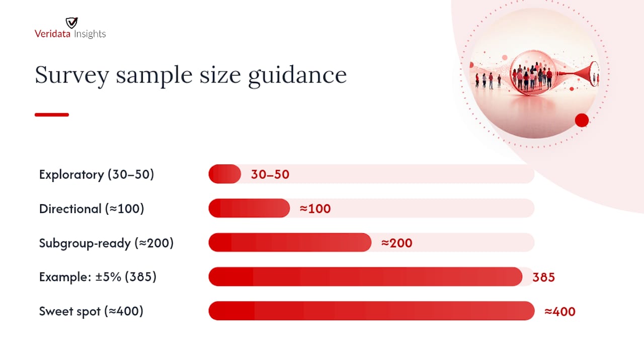
A worked example: to estimate a proportion (say, percent of customers satisfied) at a 95% confidence level with a margin of error of ±5%, you need roughly 385 completes for a large or unknown population.
Some quick rules of thumb professionals lean on:
- Around 100 completes gives you directional read for internal use, but margins of error will be wide (often ±10% or worse), so treat findings as exploratory only.
- Around 200 completes starts supporting basic subgroup comparisons, assuming your subgroups aren’t too small individually.
- Around 400 completes is a common sweet spot for general population studies needing a ±5% margin at 95% confidence.
- 30 to 50 completes is usually insufficient for anything beyond qualitative-style directional insight. It works for early-stage concept testing, not for claims you’ll defend to a board or regulator.
Sample size isn’t the whole story, though. Representativeness often matters more than raw count. A sample of 1,000 that skews heavily toward one age group, region, or customer tier can be less useful than a well-stratified sample of 400. When your responding sample doesn’t match your target population’s known characteristics, weighting can correct for that gap statistically, but weighting has limits and can’t fix a sample that’s missing entire segments altogether.
Before locking a target sample size, professionals should map budget against three questions: how many subgroups need independent analysis, what statistical tests the analysis plan requires, and how rare the target audience is to begin with. A solid survey design accounts for all three before fielding even starts, not after the data comes back thin.
The Prioritized Playbook: What to Fix First
Not every tactic deserves equal attention. Some interventions move the needle hard; others are marginal nice-to-haves. Here’s how to sequence your effort.
High-impact tactics, fix these first:
- Shorten the survey to one to two minutes, or to a single question where possible. Length is one of the most consistently documented drivers of dropout, and the systematic review found shorter questionnaires carried an odds ratio around 1.5 for increased response.
- Ask in the moment, not days later. A customer who just finished a transaction is far more likely to respond than one emailed three days after the fact. In-the-moment micro-surveys, particularly one-question formats deployed right after an interaction, routinely outperform delayed email waves.
- Meet respondents on the channel they already use. If your audience lives on mobile, a desktop-optimized survey link buried in a long email is fighting an uphill battle before it starts.
- Pre-contact and personalize the invitation. A short heads-up message before the survey lands, paired with the recipient’s name and a specific reason they were selected, consistently lifts participation over cold blasts.
- Set frequency caps. Respondents who get surveyed too often disengage fast. Cap how frequently the same person can be invited, especially in ongoing panels or tracking studies.
Medium-impact tactics, worth the effort once the basics are covered:
- Design for mobile first, not as an afterthought. Broken mobile layouts kill completion rates before a respondent even reads the first question.
- Add a progress indicator. Knowing there are three questions left versus an unknown number reduces abandonment.
- Remove forced logins or account creation wherever the study design allows it. Every extra step is a chance to lose someone.
- Fix question order and logic so early questions are easy and low-commitment, saving sensitive or effortful questions for later once the respondent is invested.
- Strip out unnecessary barriers like CAPTCHA overload or unclear instructions.
Conditional and lower-impact tactics, situational but still worth testing:
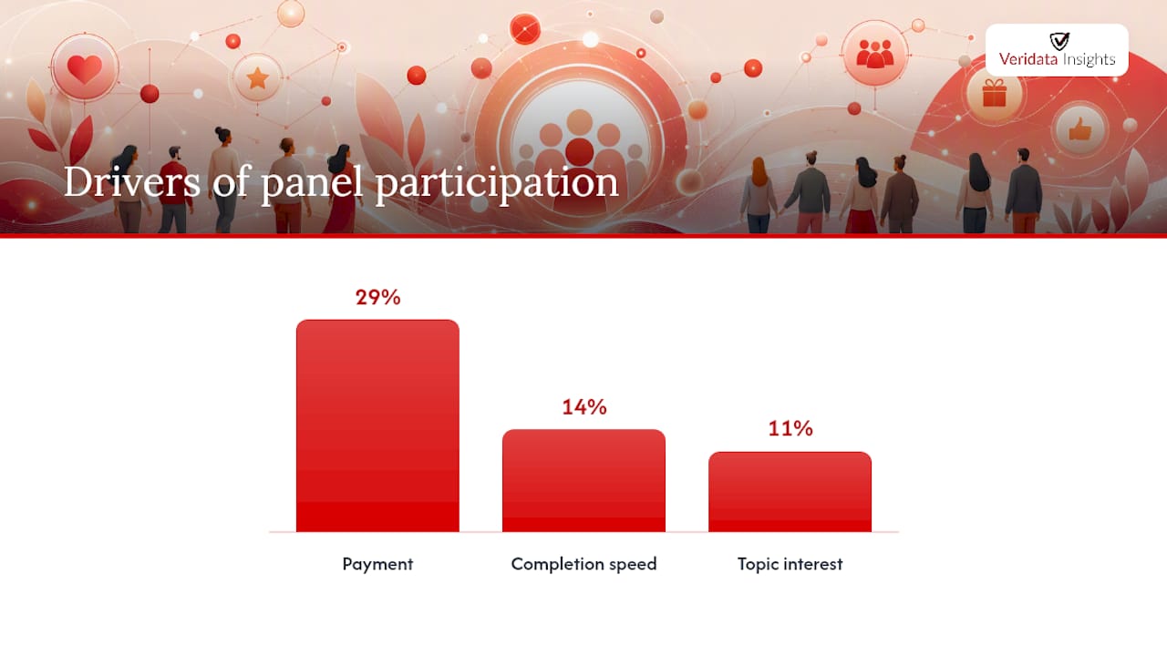
- Incentive design matters more than incentive existence. Unconditional incentives (sent regardless of completion) generally outperform conditional ones, and the review’s data put monetary incentives at an OR of roughly 1.86 to 1.88. Among panel members specifically, payment contributed close to 29% of the decision to participate in one stated-choice study, well ahead of completion speed at 14% and topic interest at 11%.
- Images in email invitations can help or hurt depending on device and email client rendering; test before rolling out broadly.
- Stamped return envelopes for mail surveys remain a proven tactic in that specific mode, though it obviously doesn’t translate to digital fielding.
- Telephone reminders for specific populations, particularly older demographics or professional audiences less responsive to email, carried the strongest single effect size in the systematic review at an OR of roughly 1.96, but the labor cost per contact is high, so reserve it for high-value samples.
Pro Tip: Test one variable at a time. If you change your subject line, incentive amount, and survey length all in the same wave, you’ll have no idea which change actually moved the number.
A simple invitation template built around these principles: open with who you are and why the recipient specifically was chosen, state the time commitment in the first line (“this takes about 90 seconds”), lead with the incentive if one exists, and close with a single clear link. Reminder cadence typically works well at three touches: an initial send, a reminder at day three or four for time-sensitive studies, and a final reminder close to the field close date with urgency language (“last chance to weigh in”).
Run every meaningful change as an A/B test where sample size allows. Split your invite list, change one element, and compare response and completion rates before committing to a rollout across your full sampling frame.
Monitoring the Field: KPIs and When to Worry
Response rate is a lagging indicator. By the time it looks bad, you’ve often already lost the window to fix it cheaply. Field managers need a small set of KPIs tracked daily, not just a final tally at close.
Track these in real time:
- Response rate: completes divided by total invited, using your chosen AAPOR formula consistently across the study.
- Participation rate: the proportion of contacted individuals who started the survey at all, a useful early signal before completes accumulate.
- Completion rate: completes divided by starts, which isolates drop-off from invitation problems.
- Median completion time: a sudden drop can signal respondents are rushing or straightlining rather than engaging.
- Drop-off by question: pinpoints exactly where respondents abandon, often revealing a confusing or overly sensitive question.
Watch for these red flags:
- Demographic skew against your known sampling frame, suggesting certain groups are underrepresented in who’s actually responding.
- Ultra-fast completes, often a sign of bots, panel farming, or respondents clicking through without reading.
- Straightlining, where a respondent selects the same answer down a grid regardless of the question.
- Unexpected item nonresponse spikes on specific questions, which often points to unclear wording rather than genuine reluctance to answer.
| KPI | Formula | Watch for |
|---|---|---|
| Response rate | Completes ÷ total invited | Falling well below your mode benchmark |
| Completion rate | Completes ÷ starts | Sharp drop-off mid-survey |
| Median completion time | Middle value of all completion durations | Sudden speed-up suggesting rushed or fake responses |
| Item nonresponse | Skipped answers ÷ total eligible responses per question | Spikes on a single question, signaling confusing wording |
When something looks off, triage in this order: send targeted follow-up to underrepresented segments, offer an alternative mode (phone instead of online, for instance) to nonresponders, top up quotas for underrepresented groups, apply selective incentives to lagging segments, and if none of that closes the gap in time, plan for weighting at the analysis stage rather than delaying field close indefinitely.
Build a short daily and weekly checklist for project managers: check response and completion rates against benchmark, scan for demographic skew, flag any single question with unusual drop-off, and confirm reminder sends went out on schedule. Weekly, review disposition codes in full and decide whether quota adjustments or mode changes are needed before the next reminder wave.
How Veridata Insights Puts These Benchmarks to Work
We’ve spent years running the exact tactics covered above across survey programming, recruitment, and fielding for clients who can’t afford to guess. Full-service market research means handling consultation and design, methodology, questionnaire review, programming, data collection, data processing and coding, and reporting and analytics, all under one roof, for B2B, B2C, healthcare, and hard-to-reach audiences.
What that looks like on a real project:
- Questionnaire review before fielding, trimming length and fixing question order to reduce drop-off before it happens, not after.
- Multi-mode execution, so a study isn’t stuck with one channel when the audience clearly prefers another.
- Targeted recruitment for hard-to-reach populations, including specialty healthcare providers and niche B2B roles where a generic panel simply won’t deliver qualified completes.
- Transparent reporting using AAPOR-aligned definitions, so the response rate you hand to your stakeholders is one you can actually defend.
Research timelines rarely respect a nine-to-five calendar, so we are available every day to meet client needs. Whether you need a full custom study or a second opinion on a questionnaire that’s underperforming, reach out to our team and let’s talk through what a realistic benchmark looks like for your specific audience.
Size isn’t everything. Quality is what makes a response rate mean something, and that’s the part we’ve built our whole practice around.
Sources
- Response rates of online surveys in published research: A meta-analysis
- AAPOR: Response rates
- Effects of interactive requests on the quantity and quality of survey responses: An international methodological experiment